T-Shirt Designs
Designing wearable graphics using color constraints and strong visual principles
Quick Summary
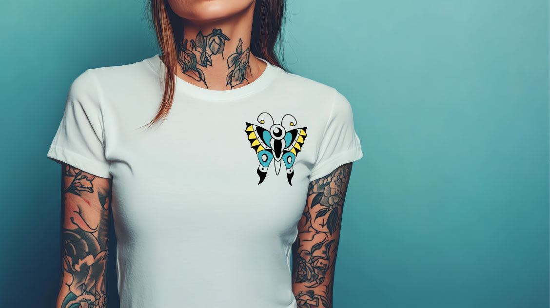
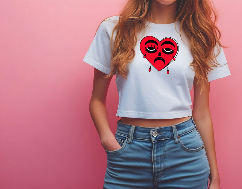
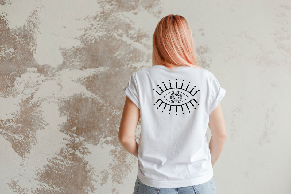
This project focused on creating three original t-shirt designs using strict color limitations (1-color, 2-color, and 3-color). The goal was to explore how color, composition, and simplification impact readability and print quality in apparel design.
Problem
T-shirt graphics must balance creativity with production constraints. Unlike digital-only designs, they need to:
Work with limited color palettes
Maintain clarity when printed on fabric
Be visually impactful from a distance
The challenge was to create three distinct designs while progressively increasing color complexity (1, 2, and 3 colors) without losing clarity or visual strength.
Role + Constraints
Role: Graphic Designer
Constraints:
3 designs total:
1-color design
2-color design
3-color design
Use of custom typography
Demonstrate mastery of:
Pathfinder & Shape Builder
Pen and Brush tools
Designs needed to be high-quality and wearable
Process
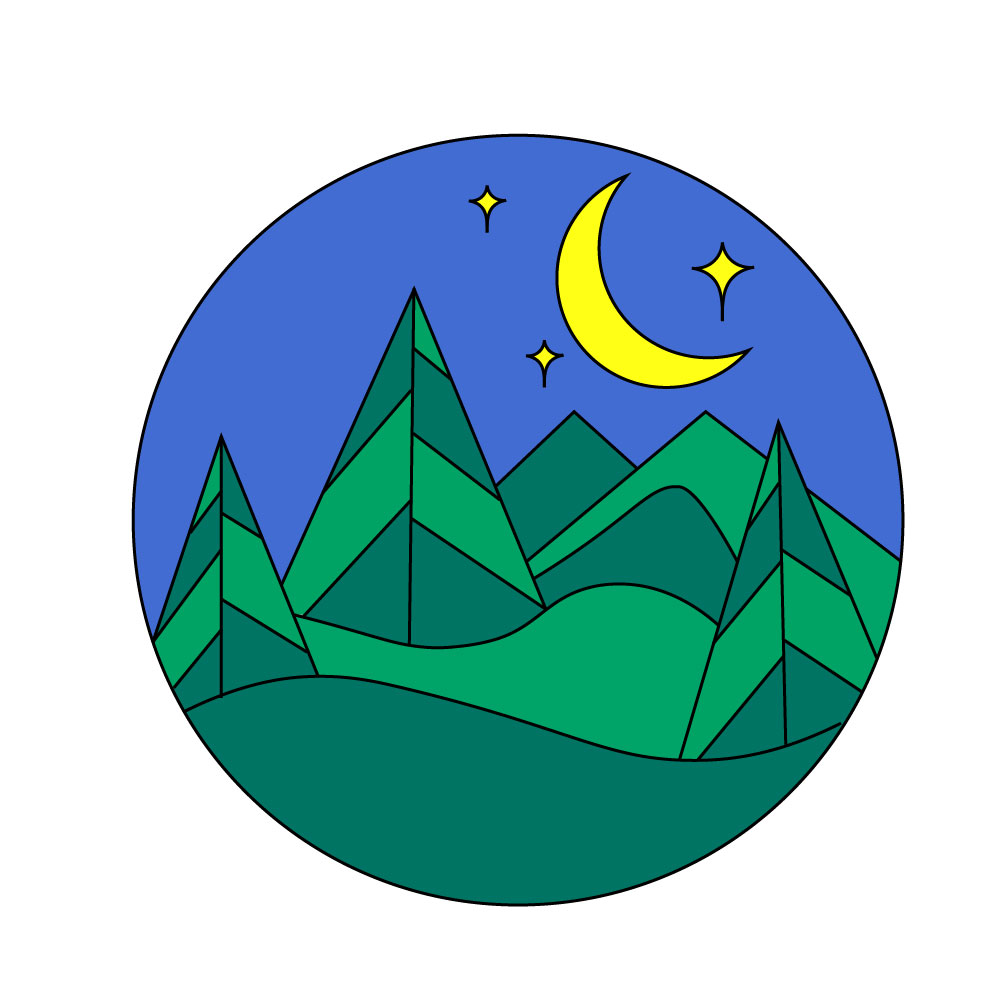
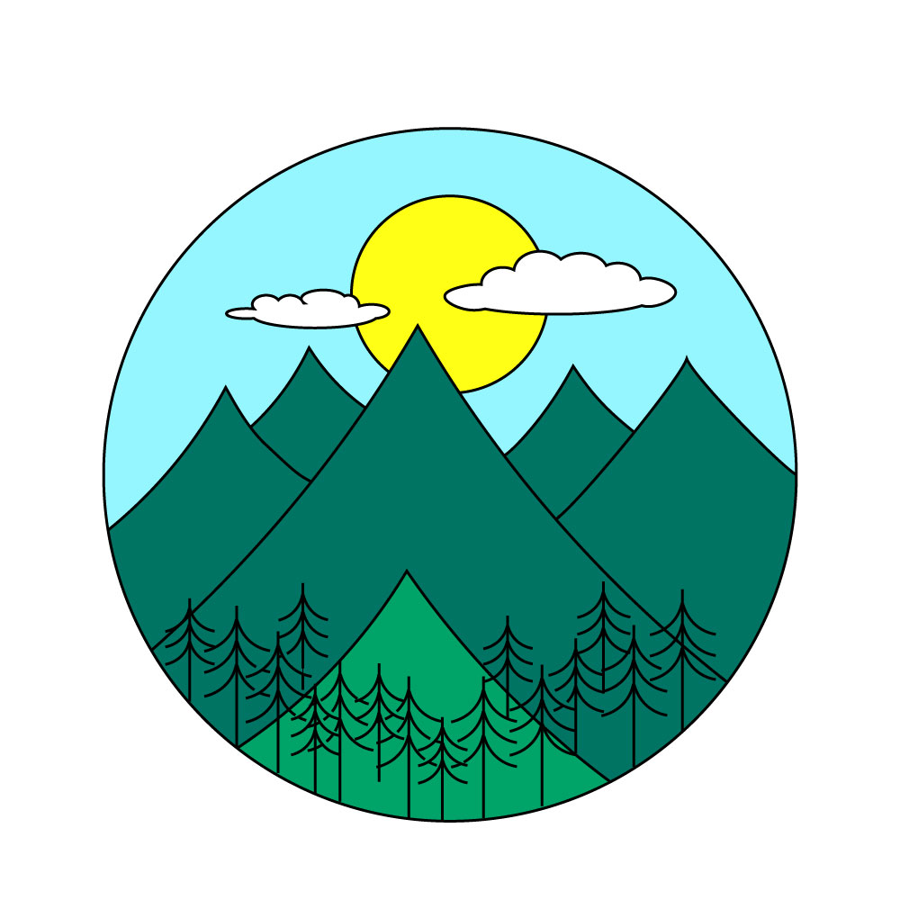
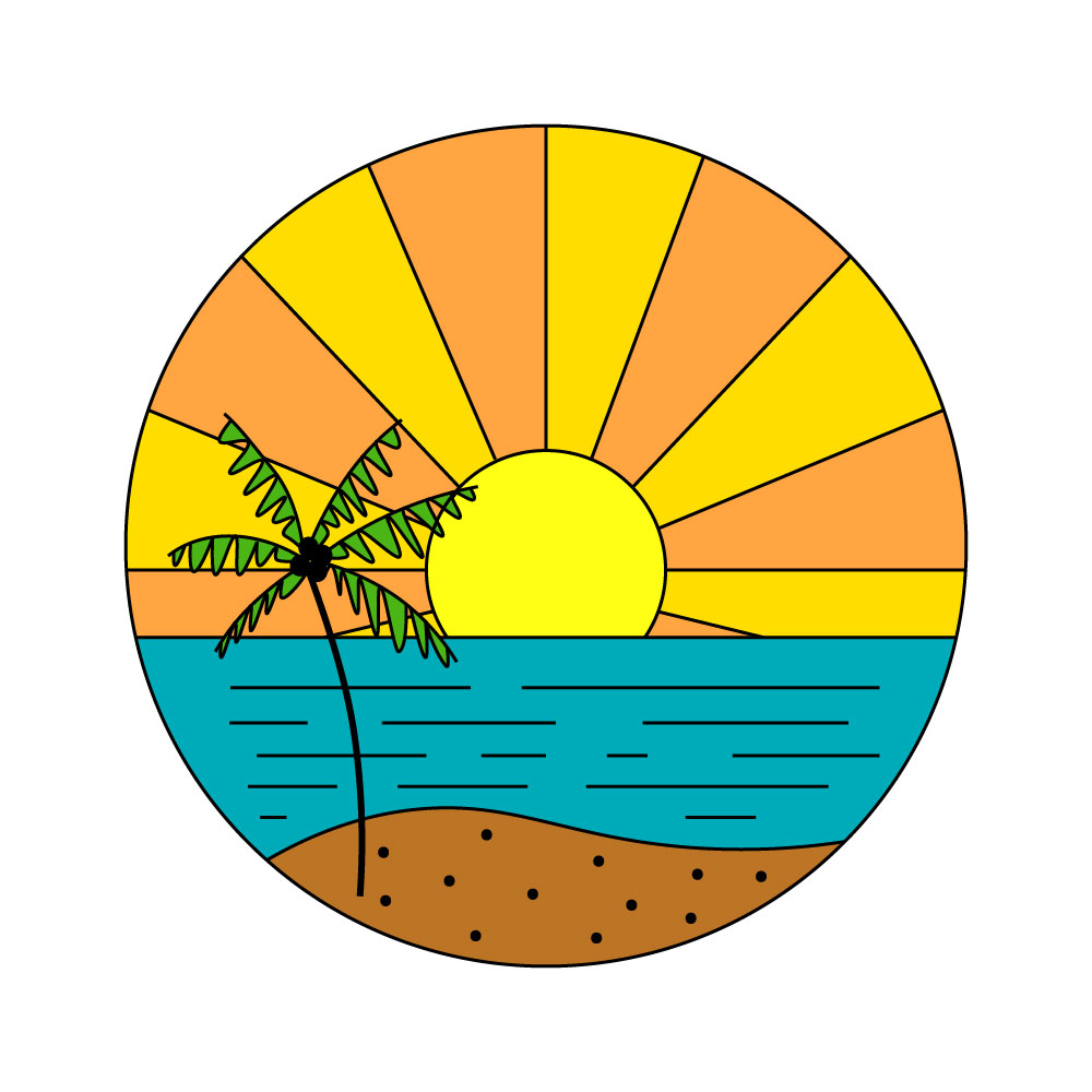
1. Ideation & Thumbnails
I brainstormed multiple concepts and created thumbnail sketches to explore:
Layout and composition
Use of typography
Visual hierarchy
This helped identify which ideas would translate best to apparel.
2. Designing with Color Constraints
Each design required a different approach:
1-Color Design
Focused on strong silhouette and contrast
Relied heavily on shape and negative space
2-Color Design
Introduced hierarchy and depth
Used contrast to separate elements
3-Color Design
Allowed for more complexity
Required balance to avoid visual clutter
3. Refinement & Tool Application
Using Illustrator, I refined each design by:
Cleaning up vector paths
Simplifying shapes for print
Using Pathfinder and Shape Builder to construct forms
Applying Pen and Brush tools for precision
4. Critique & Iteration
After presenting the designs for critique, I identified areas for improvement such as:
Enhancing readability
Adjusting spacing and composition
Strengthening contrast
I revised the designs based on feedback to improve overall quality.
Solution
The final set of t-shirt designs:
Successfully use limited color palettes without losing impact
Balance creativity with functionality
Demonstrate strong composition and visual hierarchy
Why This Works
Color limitations forced intentional design decisions
Bold shapes improve visibility and wearability
Simplified graphics translate better to screen printing
Results
Created 3 fully developed, print-ready designs
Demonstrated technical proficiency in Illustrator tools
Successfully presented and iterated based on critique
Produced portfolio-ready apparel concepts
What I Learned
This project strengthened my ability to:
Design within real-world production constraints
Simplify visuals without losing meaning
Use color strategically instead of decoratively
Contact
Interested in custom apparel or graphic design work?
Let’s collaborate — [email protected]
Simple Character Design & Animation
Designing and animating a character using simple shapes and expressive motion
Quick Summary
This project involved creating an original character using simple shapes and animating it in After Effects. The focus was on developing a clean, recognizable design and bringing it to life through motion.
Problem
Creating a simple character requires balancing:
Minimal design with strong personality
Clarity with expressiveness
A static design that can also work in motion
The challenge was to design a character that remains visually clear while also supporting engaging animation.
Role + Constraints
Role: Character Designer & Animator
Tools:
Adobe Illustrator
Adobe After Effects
Constraints:
Character built using simple shapes
10-second animation
Must include interesting movement
Original design required
Presented for critique
Process
1. Character Concept
I defined the character’s:
Personality
Mood
Visual style
This ensured the design had intention before animation.
2. Shape-Based Design
The character was built using:
Basic geometric shapes
Clean vector lines
Minimal details for clarity


In After Effects, I animated the character to:
Create engaging, natural movement
Reinforce the character’s personality
Keep motion clear and readable within 10 seconds
4. Critique & Refinement
After presenting the animation, I refined:
Timing and pacing
Movement clarity
Overall fluidity
Solution
The final result is a:
Clean, simple character design
10-second animation with engaging motion
Balanced combination of design + movement
Why This Works
Simple shapes improve recognition and scalability
Clean design translates well into animation
Movement enhances personality without overcomplicating the design
Results
Created an original animated character
Demonstrated understanding of both design and motion principles
Successfully met all project constraints and critique requirements
What I Learned
This project helped me:
Understand how design decisions affect animation
Simplify visuals for both static and motion use
Combine illustration and motion design effectively
Contact
Looking for character design or motion work?
Get in touch — [email protected]
Helping Hands App
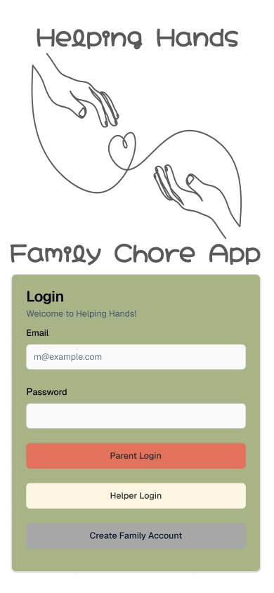
UX/UI Case Study
Helping Hands is a mobile app designed to help families organize and manage household responsibilities more effectively. The main problem I wanted to solve was the lack of clear communication and organization when it comes to assigning and completing chores within a household. Many families struggle to keep track of tasks, which can lead to confusion and frustration.
The target users for this app are parents and children who need a simple and easy way to manage daily responsibilities. My role in this project was UX/UI designer, where I was responsible for research, wireframing, prototyping, and visual design.
To begin, I created task scenarios and explored how users would interact with the app. I then developed low-fidelity wireframes to map out the user flow and overall structure. After that, I designed high-fidelity screens that focused on clarity, usability, and a clean layout. I made design decisions based on keeping navigation simple and making tasks easy to assign and track.
Throughout the process, I tested my design and gathered feedback, which helped me improve navigation and user flow. For example, I identified the need for clearer navigation and added improvements such as better organization of tasks and more intuitive screen transitions.
The final result is a user-friendly app that simplifies chore management and improves communication within families. This project helped me strengthen my skills in UX design, especially in creating user-centered solutions and refining designs based on feedback.
Problem Statement
Families struggle to organize and track household tasks efficiently, leading to confusion and poor communication.
Target User
Parents and children who need a simple and effective way to manage chores.
My Role
UX/UI Designer
Research
Wireframing
Prototyping
Visual Design
Process Images
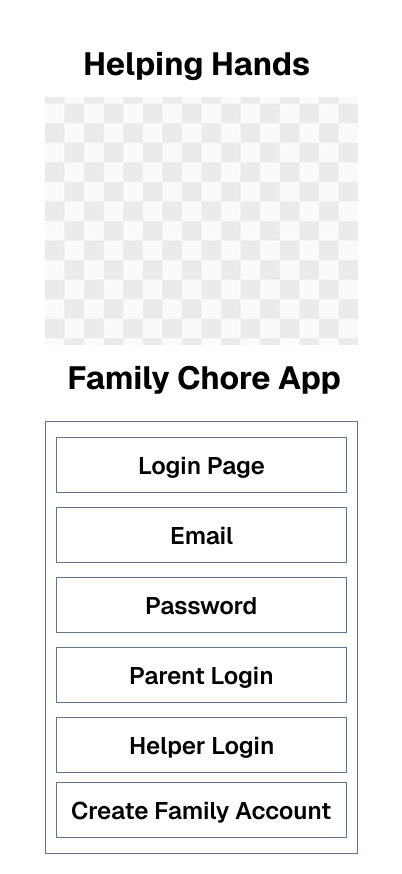
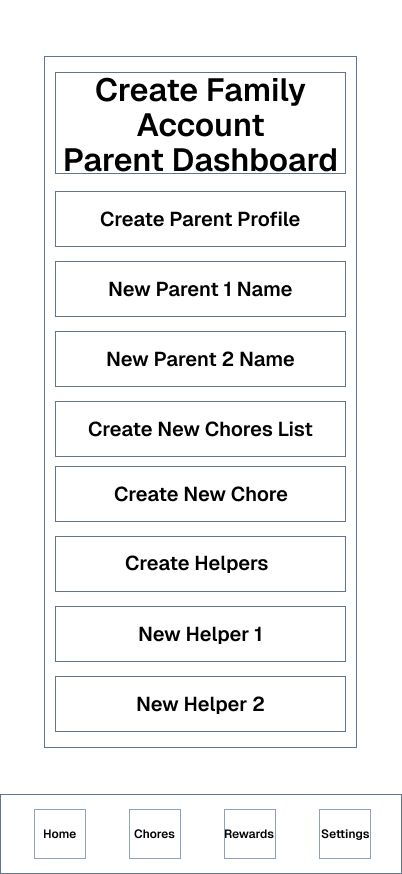
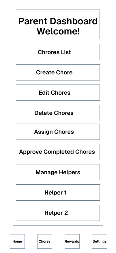
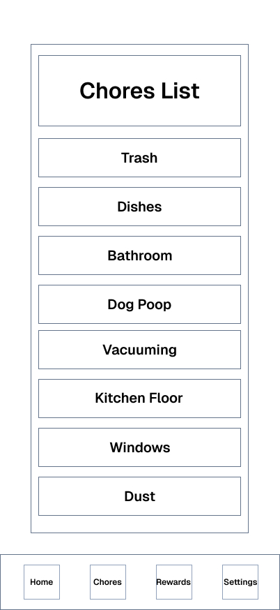
Final UI Screens
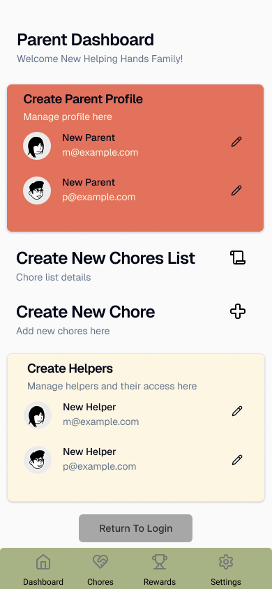
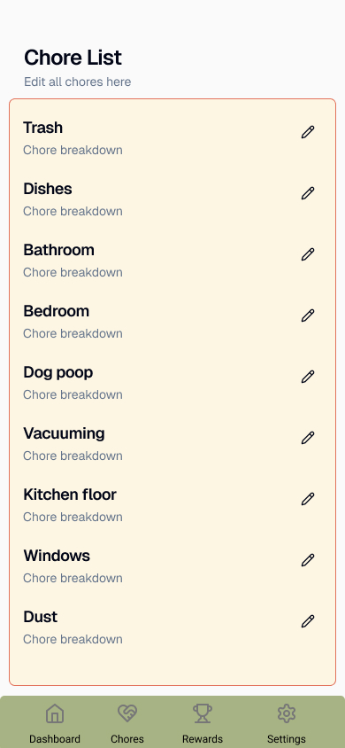
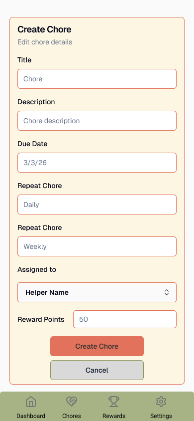
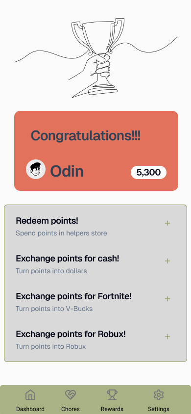
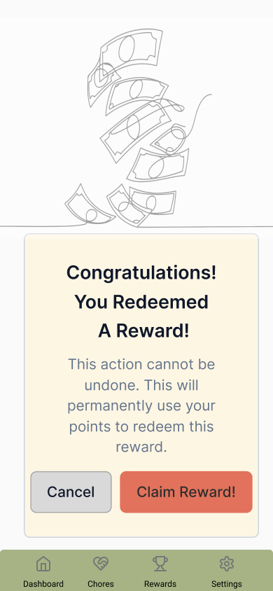
Key Design Decisions
Simplified navigation for ease of use
Clear task organization
Minimal design for readability
Reflection
This project taught me the importance of user-centered design and testing. I learned how valuable feedback is in improving usability and how small changes can make a big difference in the user experience.
MTEC Digital Design Mascot
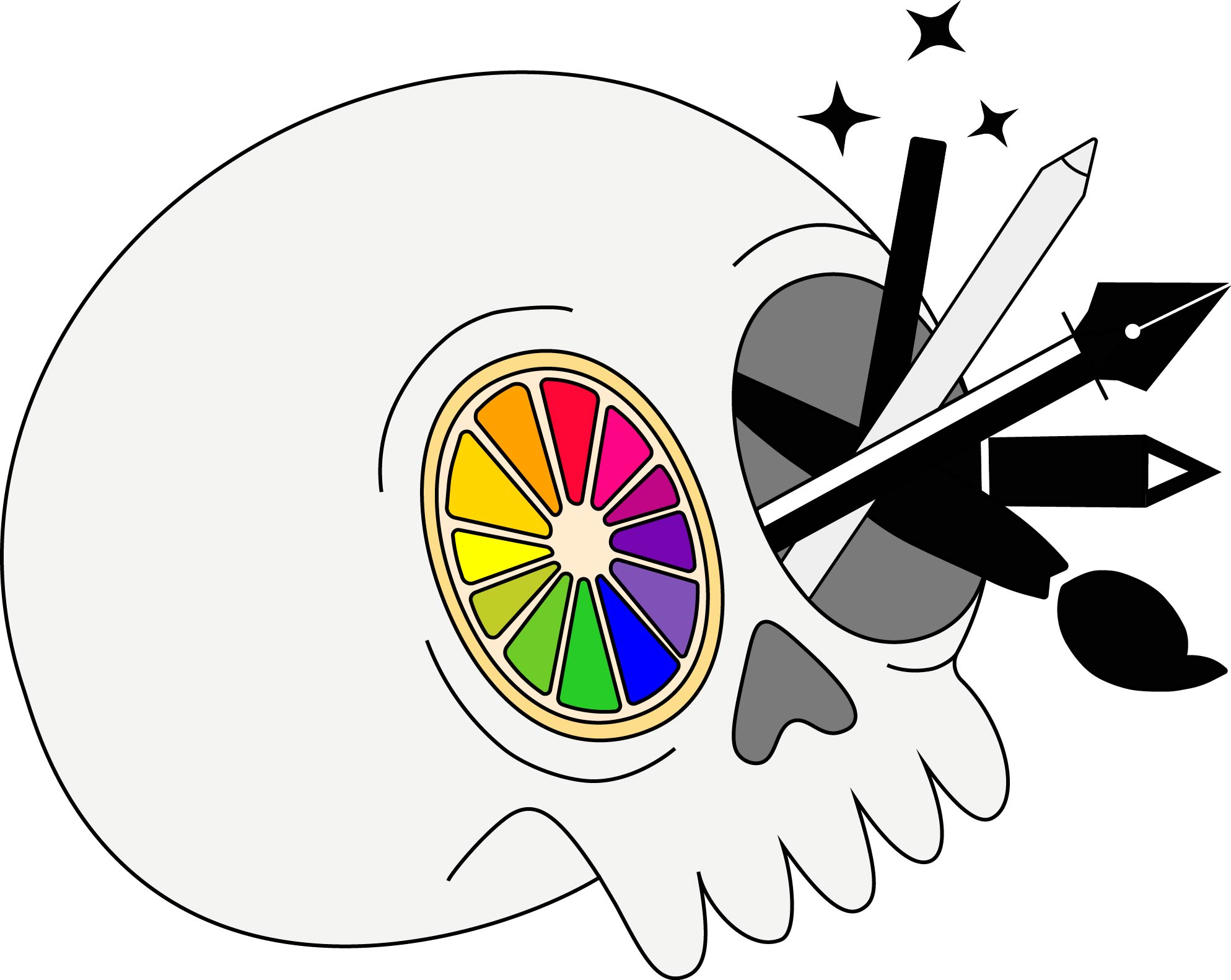
Designing a symbolic mascot that represents creativity, tools, and the foundation of digital thinking
Quick Summary
I designed a mascot for MTECH’s Digital Media program that visually represents where creativity originates. By combining a skull (symbolizing the mind), a color wheel, and essential design tools, the final concept communicates both the creative process and the technical skills used in digital design.
Problem
MTECH’s Digital Media program needed a mascot that could:
Represent both creativity and technical skill
Feel engaging and memorable to students
Visually communicate what digital design is about
The challenge was to create a character that goes beyond surface-level visuals and instead reflects the core of creative thinking.
Role + Constraints
Role: Designer & Illustrator
Tools: Adobe Illustrator
Constraints:
Had to be created in Illustrator
Needed to present concept, process, and final design
Required clear connection to a specific MTECH program
Process
1. Concept Development
I explored ideas around what digital design really comes from. Instead of focusing only on external tools, I focused on the source of creativity—the mind.
This led to the core concept:
Skull → represents creative thinking and ideas
Color wheel → represents design fundamentals
Tools → represent execution and technical skill
Tools → represent execution and technical skill
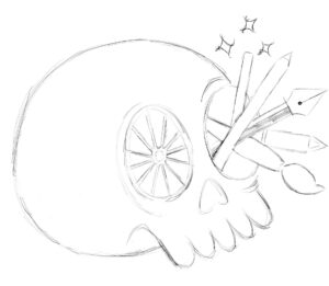
2. Ideation (Thumbnails)
I sketched multiple concepts to explore different ways to combine symbolism and personality
From these thumbnail, I selected the concept that most clearly balanced:
Meaning
Visual clarity
Creativity
3. Design Development
I refined the selected concept in Illustrator, focusing on clean vector shapes and strong visual symbolism.
-
-
-
Integrated a color wheel styled like an orange slice
→ adds creativity + makes the concept more visually engaging -
Incorporated design tools:
-
Stylus pen
-
Pen tool
-
Pencil tool
-
Paintbrush tool
-
Magic wand tool
-
-
Used bold, clean shapes for scalability and readability
Used a skull to represent the origin of creative thinking
-
Integrated a color wheel to highlight design fundamentals
-
Included tools to show the connection between idea and execution
-
-
Solution (Final Design)
-
-
-
The skull represents the origin of ideas and creative thinking
-
The color wheel (orange slice) emphasizes the importance of color in design
-
The tools highlight the technical skills used in digital media
-
-
The result is a mascot that visually communicates both conceptual thinking and hands-on design work.
Why This Works
This design is effective because it:
-
-
-
Connects concept (thinking) with execution (tools)
-
Uses recognizable design elements (color wheel, tools)
-
Balances creativity with clarity
-
Creates a memorable and unique identity for the program
-
-
Results
-
-
-
Successfully presented to class with full process
-
Demonstrated ability to:
-
Develop a concept from idea → execution
-
Use Illustrator to create clean vector artwork
-
Communicate meaning through design
-
-
-
Contact
Interested in branding, illustration, or mascot design?
Let’s work together — [email protected]
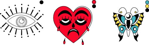
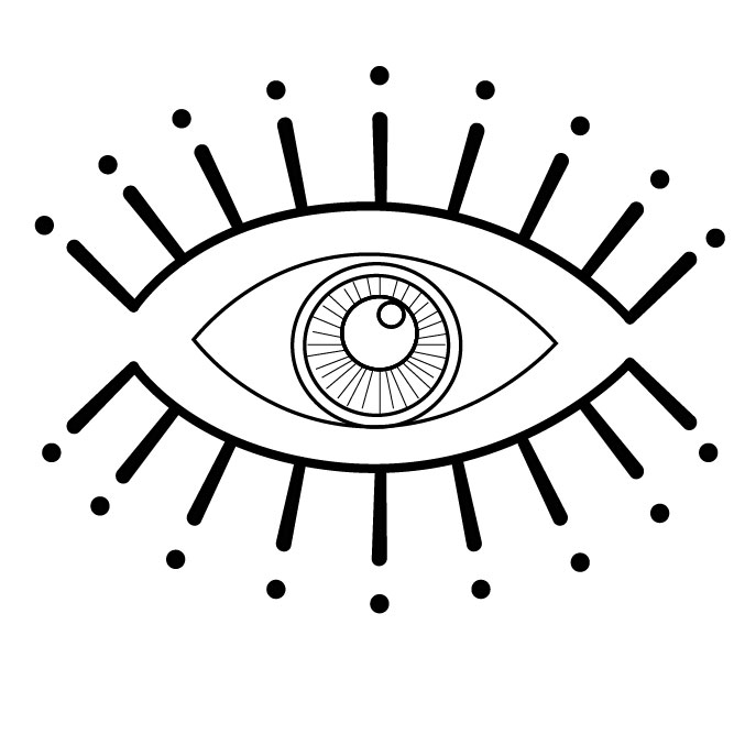
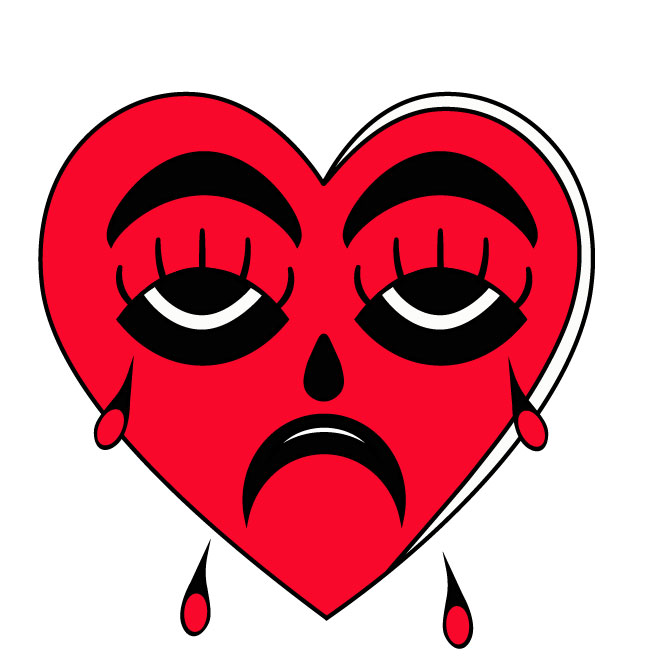
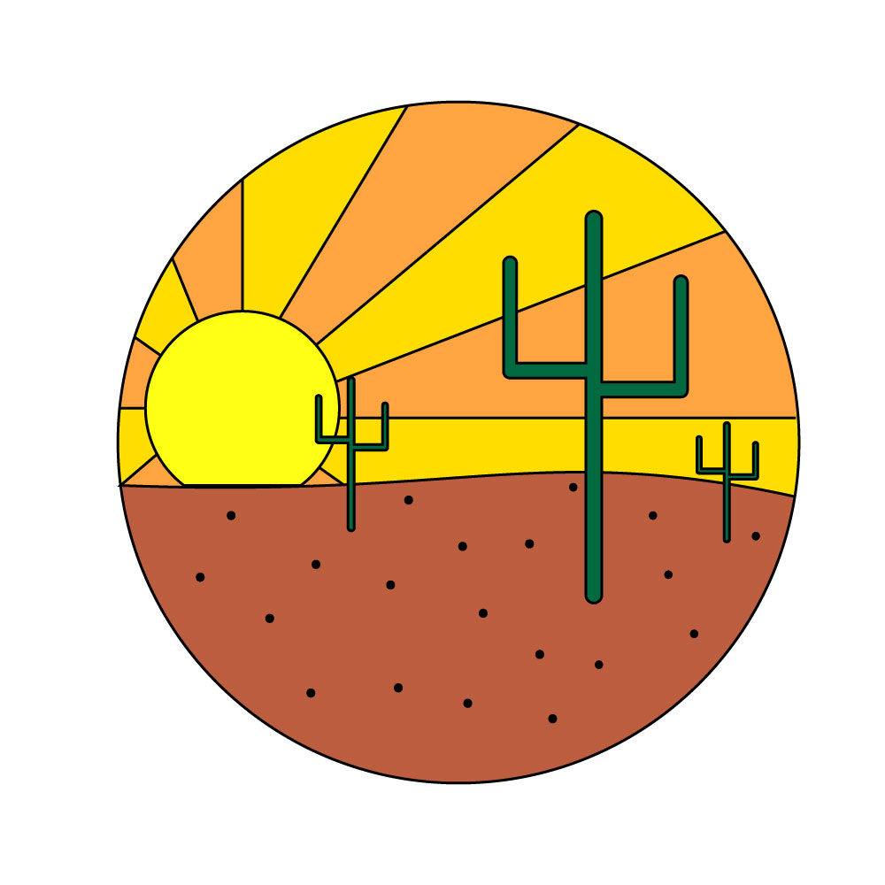
Sticker Design Set
Designing a themed sticker system for the expressive visual communication
Quick Summary
This project involved designing a set of 6 cohesive stickers based on a single theme. The goal was to create expressive, clean, and visually engaging designs that could be used for personal expression while maintaining consistency across the set.
Problem
Sticker design requires:
Strong visual clarity at small sizes
Consistency across multiple designs
A unified theme that connects the full set
The challenge was to design 6 stickers that feel like part of the same system while still being visually interesting on their own.
Role + Constraints
Role: Illustrator / Graphic Designer
Tools: Adobe Illustrator
Constraints:
6 stickers total
One unified theme
Must include cut line
Must be clean, readable, and scalable
Must follow design principles
Process
1. Concept + Theme Development
I began by brainstorming multiple sticker themes such as:
Food
Technology
Characters
Symbolic objects
I selected a single theme to ensure consistency across all 6 designs.
2. Thumbnail Exploration
I sketched a few thumbnail ideas and selected the strongest 6 based on:
Clarity
Theme consistency
Visual balance
Personality
3. Vector Development
Using Illustrator, I refined each sticker by:
Converting sketches into clean vector shapes
Adding bold outlines for readability
Ensuring strong contrast
Maintaining consistent visual style across all stickers
4. Cute Line + Final Setup
Each sticker was placed on a 1000 x 1000 artboard and a cut line was added to prepare the designs for print or production.
Solution
The final sticker set includes 6 cohesive designs that:
Share a unified theme
Are visually consistent as a collection
Work clearly at small sizes
Are print-ready with proper cut lines
Why This Works
Strong consistency creates a recognizable sticker “system”
Simple shapes improve readability
Bold outlines help with production clarity


Results
Completed a full 6-piece sticker system
Applied Illustrator tools for clean vector work
Demonstrated ability to design for real-world production
Successfully prepared files for critique and submission
What I Learned
This project strengthened my ability to:
Design within strict consistency rules
Simplify visuals for small-scale formats
Build cohesive visual systems instead of single illustrations
Contact
Interested in sticker design or custom illustration work?
Let’s connect — [email protected]